 |
| The Original Layout |
When I think of a master bedroom, I think of a quiet, relaxing comfortable space. I would say our room is far from that at this point. All I can think of is when we rile up Abby so she bolts out of our room to the stairs, turns around and runs full speed back and jumps on the bed, and repeats that 4 or 5 times. It's very fun, but I know it will have to stop one day when we get nicer things.
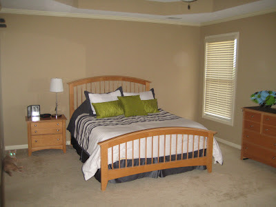
Our room does have potential because it is a decent size. So as we do with all of our rooms, the picture below shows the original owner's decorations. I shouldn't have reminded myself of what their room looked like because now our furniture definitely looks like it belongs to a 10 year old girl.
We arranged our room similarly using the long wall as the focal point with the bed centered between the windows, but with the door entering on the long side of the room, it never felt like a true focal point because of the angle, but that may just be because of the finish of the woodwork gets lost in the color of the walls or because we don't have any window treatments or artwork above the bed. This will all change one day.
What was also annoying about this layout was that the bed stared into the bathroom that doesn't have a door, so whenever Greg and I would go to bed at different times or when I would wake up earlier, the light blinds the person in the bed. I tried to get a picture of the situation, but the flash on the camera didn't do it justice, and it doesn't look so bad. Trust me, it's bad.
The new layout is against the far wall and is truly the focal point of the room. Again, mostly because you're staring staight at the bed and no thanks to any decorations. I wasn't sure if I wanted the long dresser in between the windows because it crowds the space a little, but without it that wall would be so bare. It needs some giant paintings!
What bothers me most about all of these matching bedsets is that it doesn't come with 2 night stands. I don't like that it's not symmetric on each side of the bed. So, when we finally decide to buy new furniture for our room, I'm going to break up a set and get some different pieces that still go together.
Enough about reality, let's dream for a bit before I head off to my child-like bedroom.
A picture of a master bedroom that I have always liked is shown below. I can't decide if I'll move forward with it because it doesn't have a contemporary feel and may be a bit too elegant for me. And, let's be honest, Greg would never go for the mirrored night stands. Although, we do want a smaller couch or bench at the end of the bed or a seating area, and we've even thrown around the idea of hardwood floors upstairs at least in the hallways, but maybe in our room, so we can have a fantastic area rug to add lots of personality.
Well, this will have to do until next year when I get into the design phase of the room.
Good night!


No comments:
Post a Comment